Introducing our new logo
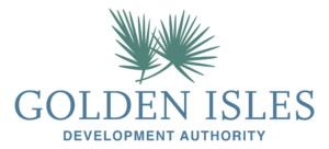
The process of rebranding the Development Authority kicked off in June 2019 and hit a significant milestone this week with the unveiling of its new logo.
At the reveal this past week, the Golden Isles Development Authority and the Brunswick & Golden Isles Chamber of Commerce provided the first look of their respective new logos together with the stakeholders that were involved in the design process.
The final logo selected took months of research and input from internal partners and outside influencers. Capturing the sentiments of the region, and goals of the Development Authority, in a single symbol proved no easy feat. Fortunately, the Development Authority had the help of community partners, and of the Chamber staff with whom they collaborated with during the process.
Additionally, selecting h20 creative group, a Brunswick-based marketing firm, was an essential factor in the success of the project. h20 not only has intimate knowledge of the region but has worked with other local organizations and partners, including the Downtown Development Authority. Working with h20 ensured that the logos would be distinct enough to set each organization apart, while also complementing the ascetic of the Golden Isles. For the Development Authority, this was imperative to the new logo design. Producing a logo that could generate a sense of place and help outside influencers identify with the coast is essential in their efforts to attract new business and investment to the Golden Isles.
The design was influenced by the place and emotion that the Development Authority’s board and community members expressed was essential to the rebrand.
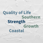
Common themes, or terms, in these discussions included: Quality of life, Strength, Southern, Coastal, and Sophisticated. The final logo hits many of the goals at first glance. The selection of palm fronds also offers special symbolism for the region and the organization.
The Chamaerops Humilis Palms, which the frond logo symbolizes, are found in abundance in the Golden Isles. The palms can grow in a variety of conditions and show resilience in the face of obstacles. Palm trees and their fronds are a long-standing symbol for victory and triumph dating back to Ancient Roman times. Strength and growth were terms often used to describe the Golden Isles while researching the logo; thus, this hardy palm is an excellent symbol for the community.

The selection of colors for the logo and brand also reflects the unique place that is the Golden Isles. The palate consists of greens and blues from our coast and a golden yellow for our marshes.
It’s exciting to hit the milestone in the rebrand with a symbol that reflects the region and community, but there is still more work to follow. Updates and improvements to the website will continue. Also, communication strategies for LinkedIn, Instagram, Facebook, and email are all in progress as a part of the rebrand.
Ultimately the rebranding will support the Golden Isles by strengthening the region’s brand as a premier business location and communicate the Golden Isles Development Authority’s role in providing business attraction and retention services.
